Typography
Downloads & Links
Overview
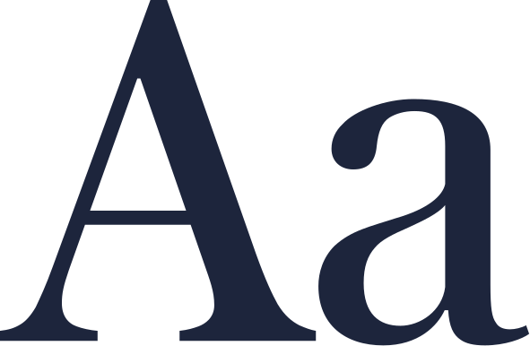
Typography is a primary carrier of the CMC brand. Used well, it establishes hierarchy and guides the reader. We pair the refined editorial elegance of Austin News Deck with the structural strength of Neue Haas Grotesk. Together, they establish a deliberate visual language rooted in confidence and timelessness.
Fonts
Austin News Deck is reserved exclusively for high-impact display typography, such as short headlines and statistics.
Standard headings are set in Neue Haas Grotesk Display Pro, while body copy and product interfaces utilise Neue Haas Grotesk Text Pro for readability at smaller scales.
Sizing, Tracking, Leading
Setting the correct weight, letter spacing (tracking) and line height (leading) is important for maintaining consistency across the brand.
Specific type sizes are intentionally omitted as each format, from web to trade booths, will require its own type scale. Use this as a starting point for hierarchy and then adapt the styles to the needs of your format.
- Display 1Roman-3%90%
- Heading 1Roman0%95%
- Heading 2Roman0%100%
- Heading 3Roman0%110%
- BodyRoman0%130%
- LabelRoman4%120%
- CaptionRoman0%130%
Web-safe Default
Arial replaces Neue Haas Grotesk, and Times New Roman replaces Austin News Deck in web applications like Microsoft Word and Powerpoint templates to make them more accessible.